
A language school takes most of its enrolments through its website. In September the director notices that enrolments are down on last year, although more people are visiting the site. The marketing agency proposes a redesign. The web developer proposes a faster server. A board member has read that the button should be orange.
Each of them may be right. Nobody in the room knows, because nobody has yet found out where on the way from "interested" to "enrolled" people are giving up. Optimizing the experience before knowing that is guesswork with a budget.
What user experience optimization is
User experience optimization is making an existing product easier to use for the things people come to do, in order of how much each improvement matters. It is work on something live, with real users and real evidence, and it proceeds one change at a time so that each can be judged.
The word "easier" can be made precise. Jakob Nielsen, whose definitions the field still uses, describes usability by five components: how easily people accomplish a task the first time, how quickly once they know the design, how easily they pick it up again after a break, how many errors they make and how well they recover, and how pleasant it is to use. He sets a sixth quality beside them, utility, meaning whether the product does what people need, and observes that "it matters little that something is easy if it's not what you want". His summary of the stakes on the web is three words long: "people leave".
Two things follow for the person paying. Optimization is not decoration: none of the five components is about how a page looks. And it is not a redesign. A redesign changes everything at once, including the parts that worked, and afterwards nobody can say which change helped. The same distinction is drawn for older systems in application modernization: what it means and when to do it.
Find the fault before fixing anything
The method is short, and its order is the point.
- Choose the journeys. A journey is one task from start to finish: finding a course, enrolling, paying. Pick the two or three the business depends on. A review of everything finds a little about everything.
- Walk each one. Step by step, on a phone and at a desk, as a newcomer would. Note where the next action is unclear, where the wording misleads, where the page makes people wait, where the layout breaks.
- Read the evidence you already hold. Where do people leave, according to your analytics? What do they phone or write to ask? Support messages are a free record of where the product failed to explain itself.
- Write down what you cannot see. If nothing records how many people start the enrolment form, say so. That gap is a finding.
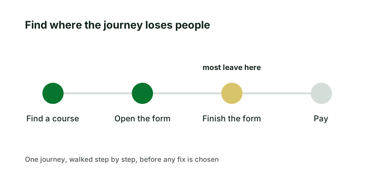
Only then come the fixes, and by this point most of them are obvious and small.
How to rank what you find
A walk through three journeys produces thirty or forty findings. A team can act on a handful. Four questions put them in order.
- How serious is it? Does it stop people, slow them, or only irritate them?
- Whom does it affect? Everyone on a phone is a different matter from one browser in a hundred.
- How sure is the evidence? Seen in the figures, seen in a walk-through, or suspected.
- How much work is the fix? A sentence, a form, or the structure underneath.
Serious, widespread, well evidenced and cheap goes first. That sounds too simple to need saying, and it is the opposite of how most lists are worked, which is in the order people complained.
Keep one caution in view. Nobody can promise that a given change will raise sales by a given figure. What can be promised is that the change is made where a real obstacle was found, and that the figure is measured before and after. The test for any such claim is the one set out in benefits of application modernization you can check: what is the figure today?
Three journeys walked at the language school
Return to the language school (invented). Before choosing between the redesign, the server and the button, the director asks for the three journeys to be walked: finding a course, enrolling, and paying a deposit.
The analytics show that seven visitors in ten are on a phone, and that most who open the enrolment form do not finish it. The walk-through shows why. On a phone the form asks for the course code, which appears only on the course page the visitor has just left. The date-of-birth field rejects the format most people type, with a message that says "invalid". The level test, which the school asks every student to take first, is a document to download and email back.
Thirty-four findings are ranked. Three sit at the top: carry the course into the form so that nobody types a code, accept the date in any common format, and say what happens after the level test. All three are small. Two findings are structural: the level test should be taken on the site, and course dates are stored as text, which is why they cannot be filtered. And one gap is recorded, that nothing measures how many people start the level test.
The redesign is postponed. The top three fixes go live within a fortnight, and form completions are compared with the month before. The level test is a different kind of problem: a step done by email and by hand, which is a process to be built, as described in process automation: what to settle before building.
Walking your own journeys first
- Name the two or three journeys your business depends on.
- Walk each one on your own phone, slowly, and write down every hesitation.
- Read a month of support messages and mark the ones a clearer page would have prevented.
- Rank what you find by the four questions before anyone proposes a design.
If you want that done from outside, by someone who has not learned to walk around the faults, it is what our UX audit provides: a fixed-scope review of up to three key journeys, with the findings ranked by impact and a plan you keep, before you pay for a redesign.
Sources
- Jakob Nielsen, Usability 101: Introduction to Usability, Nielsen Norman Group, 2012.
Keep reading
AI integration: connecting a model to systems you run
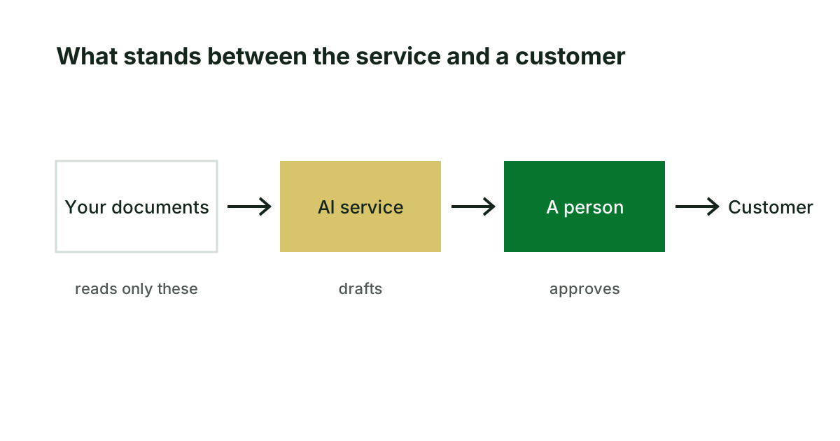
An AI service that drafts from your own documents is an integration project. Five questions to answer before it goes live, and the two figures to ask for.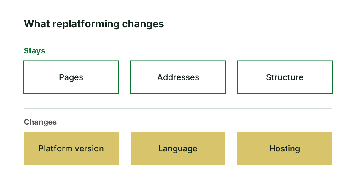
Legacy application replatforming: when it is enough
Replatforming moves an application to a current platform and keeps the rest. When that is enough, when it is not, and five questions for any quote.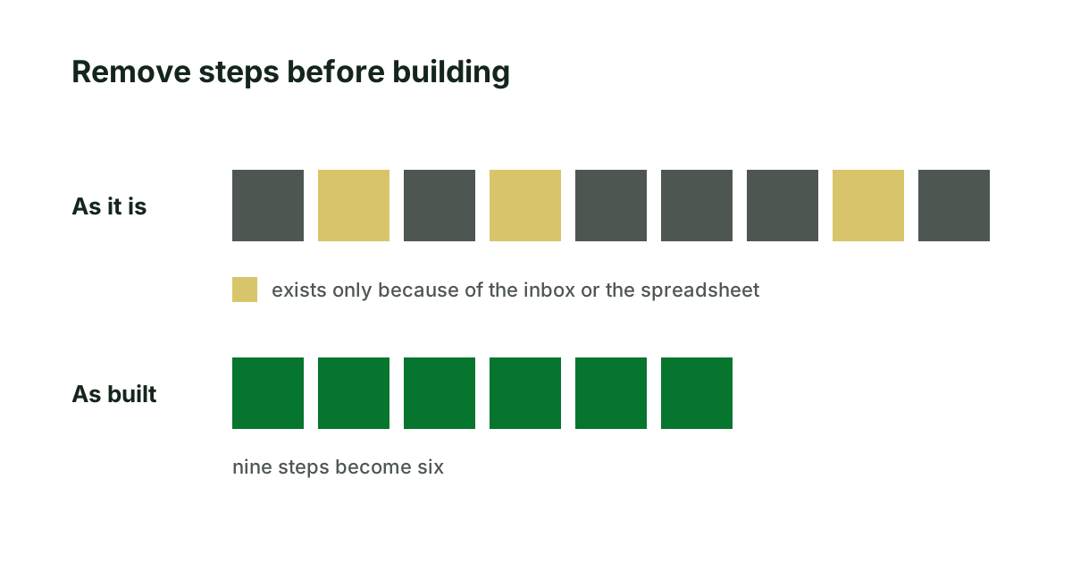
Process automation: what to settle before building
Automating a process as it stands keeps what is wrong with it. Four questions that pick the right process, and five things to write down before any software.